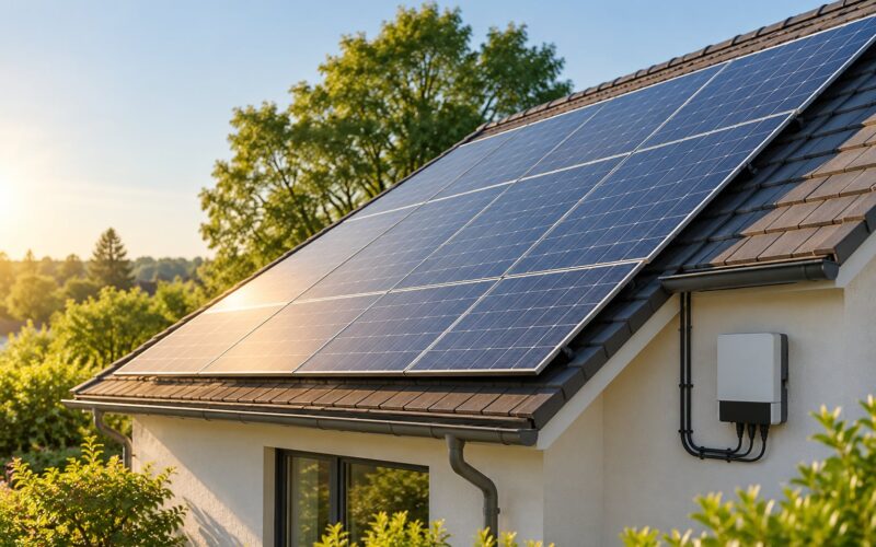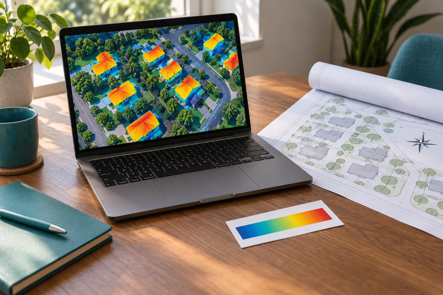
Knowing how to read a solar irradiance map takes about ten minutes: find your property, find the legend, read the number that matches the color under your roof, and check what the map is silent about. That last part is where most people go wrong, because a strong regional value tells you nothing about a specific chimney, a neighbor’s oak tree, or a fence. This guide walks through the whole process and shows you how to turn one map reading into a realistic expectation.
Everything here works for a free web map, a printed report from an installer, or a page your neighbor emailed you. You do not need any calculation software to follow along.
Table of Contents
- What You Need
- Step-by-Step: How to Read a Solar Irradiance Map
- 1. Confirm the Location and Map Type
- 2. Read the Units Before Comparing Colors
- 3. Match the Site Color to the Solar Irradiance Map Legend
- 4. Look for Shade, Obstructions, and Site Boundaries
- 5. Compare the Map With Your Solar Project
- 6. Record and Verify the Reading
- Common Mistakes
- Frequently Asked Questions
- What does a high value on a solar irradiance map mean?
- Can I compare two locations on a solar irradiance map?
- Can a solar irradiance map help me choose solar garden lights?
- Does a good irradiance value guarantee high solar panel output?
- When should I use more than a solar irradiance map?
- Conclusion
What You Need
You need four things before a map number means anything: the map itself, its legend, the address of the site, and a rough sketch of the ground.
- The map and its legend, including the label that names the measurement. If a PDF arrived without a legend, it is not usable — request it.
- The exact address, not just the town. Regional maps collapse miles of different terrain into one color.
- A compass or a north arrow on the site plan, so you can work out the roof’s tilt and azimuth.
- A way to record readings — a note, a photo, a screenshot. You will want three or more data points, not one.
As for where the maps come from, four free tools cover almost everything a homeowner needs. PVGIS, run by the European Commission’s Joint Research Centre, gives monthly figures and specific yield for an address and lets you set tilt and azimuth. NASA POWER returns a point value for any coordinate. The Global Solar Atlas, published with the World Bank, is the most visual. NREL’s NSRDB and PVWatts are the reference behind most North American calculators. Each one uses a different satellite dataset, which is exactly why two maps of the same street can disagree.
Step-by-Step: How to Read a Solar Irradiance Map
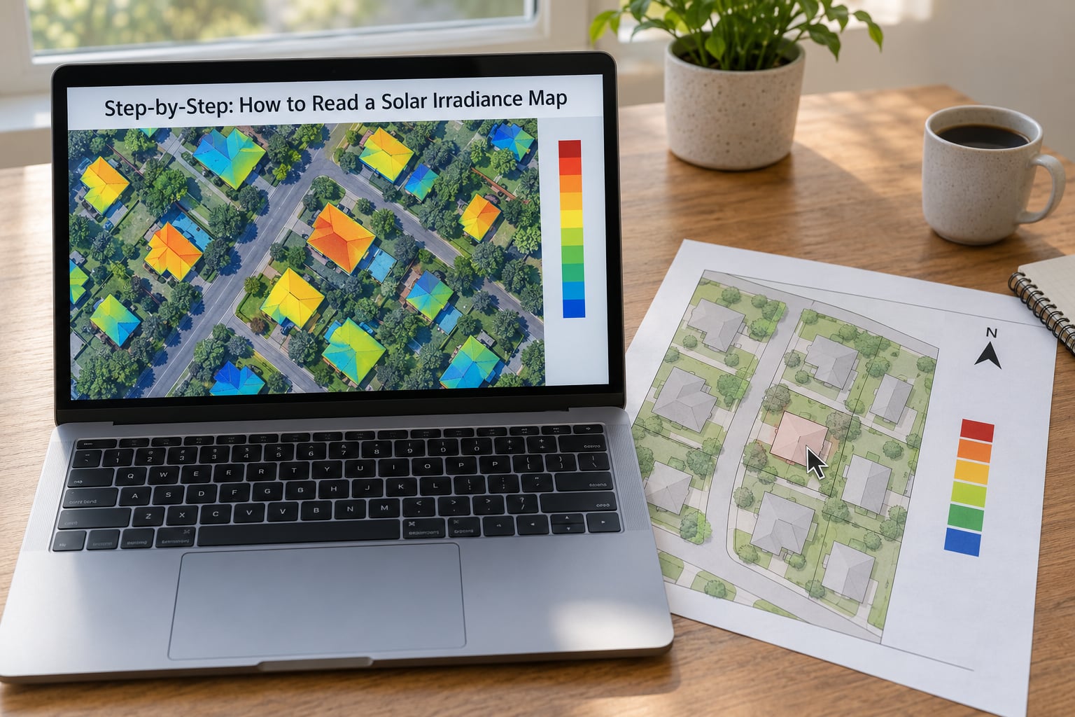
Work through the six steps in order and you will end up with a defensible number plus a short list of what still needs checking on site. The whole process takes ten to fifteen minutes.
1. Confirm the Location and Map Type
Start by proving the map is describing your property and knowing exactly what its color field represents. A solar irradiance map is a modeled average, not a live reading and not a weather forecast.
Look for three things before anything else. First, the address or coordinate field — enter the street address, not the postal code, and confirm the marker lands on your house rather than five miles out. Second, the dataset name and its date, usually printed in small text in a corner. Older satellite datasets get superseded, and the new version may shift a value by several percent. Third, the layer type.
Common layer types, and what each one actually tells you:
- Annual average solar resource — the long-run yearly mean at each cell. The most common free layer, and the least specific.
- Monthly production potential — twelve values, useful for seeing how lopsided your seasons are.
- PVOUT — photovoltaic power output, already expressed in kWh per kWp per year, with a standard set of system losses assumed.
- PVWatts output — a modeled production estimate for a specified system size, not a resource measurement at all.
That last distinction catches people. A map labeled PVOUT has already baked in assumptions about panel efficiency and losses, so you cannot treat its number as raw sunlight.
2. Read the Units Before Comparing Colors
Check the unit label before you compare any two colors, because the same map can be published in several different measures. Higher is generally better within a single unit, but a number in one unit is meaningless next to a number in another.
Power and energy get mixed up constantly, so it helps to hold the distinction firmly: irradiance is power arriving per unit area, measured in watts per square meter, while irradiation is energy arriving per unit area over a period, measured in kilowatt-hours per square meter per day or per year. The map you are looking at may show either.
| Measure | What it means | Why you care |
|---|---|---|
| W/m2 | Power hitting a surface at one instant | Clear-sky peak sits near 1000 W/m2, the reference everyone quotes as full sun |
| kWh/m2/day | Energy arriving per square meter in a day | The most common figure on public maps, and the one color bands usually represent |
| kWh/m2/year | Annual energy per square meter | Multiply the daily figure by 365 for a rough check |
| Peak sun hours | Hours at full-sun equivalent needed to deliver the day’s energy | A shortcut: divide kWh/m2/day by roughly 1 kW/m2 for good conditions |
| GHI | Global horizontal irradiance, total on a flat surface facing up | What most free maps show by default |
| DNI | Direct normal irradiance, the beam aimed straight at the sun | Drives concentrated and tracking systems more than rooftop panels |
| DHI | Diffuse horizontal irradiance, scattered and cloudy light | The share that keeps shaded panels producing something |
| POA | Plane-of-array, irradiance on your tilted, aimed surface | The number that actually predicts a fixed rooftop array |
| kWh/kWp | Specific yield, annual energy per unit of installed capacity | How installers compare sites with different system sizes |
A flat map showing GHI understates a south-facing roof and overstates a north-facing one. Never convert a GHI reading into a production promise without adjusting for tilt and azimuth first.
3. Match the Site Color to the Solar Irradiance Map Legend
Find the color under your property, trace it sideways to the legend, and read the number range printed there. Then estimate a value from that range rather than inventing precision.
Color order is not standardised, which trips people up more than anything else on this page. One tool paints the best resource deep red, another paints it dark blue, and some reverse the scale entirely. What is consistent is the legend, so read the legend first and only then look at the map. On a color-blind-friendly or reversed scale, the darkest band is still the highest resource level in almost every published map, but verify it against the printed ranges.
| Band | Typical range (kWh/m2/day) | What it means in practice |
|---|---|---|
| Lightest or palest band | Under 3 | Low resource. A system can still work, but orientation and shade carry unusual weight here |
| Light to mid band | 3 to 4 | Moderate. Ordinary rooftop economics, and worth checking local incentives before committing |
| Mid to dark band | 4 to 5 | Good. Most of Europe, most of the US Midwest, and large parts of the Southwest sit here |
| Darkest band | 5 to 6 and above | Very strong resource, typically desert and high-altitude regions. Output is limited by hardware, not by sunlight |
A smooth gradient deserves a different treatment from a stepped scale. If the legend runs as a continuous ramp, the honest answer is a range plus a midpoint, not four significant figures. Nobody can defend a reading of 5.17 kWh/m2/day from a color swatch.
4. Look for Shade, Obstructions, and Site Boundaries
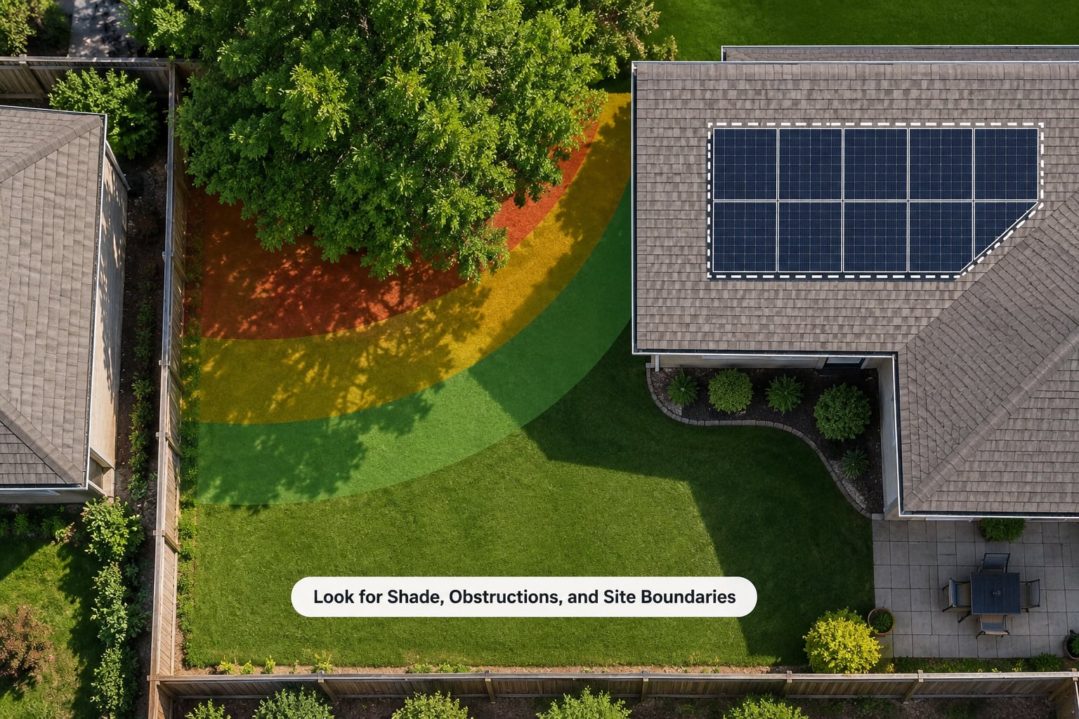
A strong regional value does not make a shaded site viable, and this is the single largest gap between map and reality. Every public map you will use models the ground at roughly 500 meters to 4 kilometers per cell, which means your chimney is not in the data.
Before treating a color as usable, walk the site and list what sits between the sun’s path and the panels. Trees are usually first, and note the species and height rather than a vague note about greenery. Neighboring buildings and rooflines matter more in dense areas than almost anything else. Terrain does too, since a valley floor can sit in shadow for hours while a ridge a mile away is bright all day. Roof edges, dormers, chimneys and parapets cause localized loss that a regional cell cannot express, and fences, sheds and carports throw shorter shadows that still land on a low panel array or a garden light.
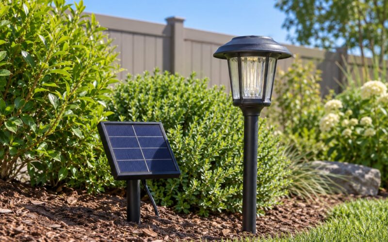
For a small setup like a string of solar garden lights, shade behaves differently than it does for a rooftop array. A light under a tree may run on a fraction of its rated hours, while a single light in open sun on the same property is fine. Map values are useful for choosing a region of the garden; they are not a substitute for testing the actual spot.
If a major obstruction is involved — a large tree, a taller neighbouring building, a hillside — get a site-specific shade assessment. Many installers include one, and that is a far better basis for a decision than any public map.
5. Compare the Map With Your Solar Project
Use the map to screen and compare, not to sign off. Its job ends once it has told you which of two candidate properties deserves the next hour of your time.
Three comparisons are worth making. First, between properties: if one sits in the 4 to 5 band and the other in the 3 to 4 band, that difference usually matters more than any equipment choice you make later. Second, between orientations on the same roof: a map with a tilt and azimuth selector lets you check how much a south-facing array gains over an east-west split. Third, between map datasets: when two sources disagree, check whether one shows GHI and the other POA, and whether one is annual while the other is a monthly peak.
Here is how a reading converts into a rough expectation. Suppose your property reads 5.2 kWh/m2/day of GHI and you are considering a 7 kW rooftop array. The arithmetic goes like this:
- 5.2 kWh/m2/day at roughly 1 kW/m2 of reference peak is about 5.2 peak sun hours.
- 5.2 hours multiplied by 7 kW gives about 36 kWh on an average clear day at that irradiance.
- Applying a standard system loss allowance of roughly 14 percent brings that to about 31 kWh per day.
- Over a year, that lands in the neighborhood of 1,000 to 1,200 kWh per installed kWp, which is a normal range for a good site.
Two cautions on that chain. Losses should be applied once, and only for things the map genuinely excludes — soiling, inverter conversion, cable losses, mild mismatch. Shading and orientation are separate corrections, not part of that 14 percent. And the result is an average, so expect individual months to land well above or below it.
For low-power products such as solar garden lights, the arithmetic is much smaller and the ranking is what matters. A light needs a few hours of usable sun a day, and a 5 kWh/m2/day reading comfortably clears that, while a 3 kWh/m2/day site in heavy shade may not. Use the map to decide which half of the garden to furnish, then confirm the specific spot.
6. Record and Verify the Reading
Write down what you read before you forget it, because almost every disagreement about solar numbers starts with two people holding different assumptions. A short record takes two minutes and settles most conversations later.
Record these six things: the value or range, the unit, the dataset name and version, the map date, the zoom level or cell size, and whether the figure is GHI, POA or PVOUT. Then record two additional readings at nearby points — one a few miles away, one in the neighbouring band — so you can see how fast the gradient changes near your site. A sharp jump between two nearby points usually means terrain or a dataset boundary, not a property that is somehow twice as sunny.
That saved record is exactly what you need when a second map gives a different answer. Comparing two maps of the same address is how you learn to read a solar irradiance map properly: same location, different dataset, different resolution, different assumption set, therefore a different number. Neither is wrong. Now confirm the reading that matters with elevation, aspect, a shade assessment, or an installer’s own site survey before you commit money to anything.
Common Mistakes
Almost every bad solar estimate I have seen traces back to one of these. The fix is usually simple, and none of it requires software.
- Treating irradiance as production. A map tells you how much sun energy reaches a square meter. It says nothing about panel efficiency, inverter losses, wiring, or how much of the roof is usable. Convert through specific yield, never by assumption.
- Comparing numbers in different measures. A PVOUT figure and a kWh/m2/day figure come from different calculations entirely. Match the measure before matching the values.
- Reading color as guaranteed sunlight. A dark band over your town means good regional resource, not good resource on your roof. Cell sizes of 500 meters or more cannot see a single tree.
- Ignoring the seasonal or hourly layer. An annual average hides the fact that many mid-latitude sites produce a large share of their annual energy in a few summer months. If your plan involves a battery, seasonality matters more than the annual figure.
- Skipping obstructions. Walk the site. This is the cheapest correction available and the one most often skipped.
- Using an outdated map. Satellite datasets get revised. Check the date, and if two maps disagree, look at which is newer before deciding which is wrong.
- Double-counting losses. Applying a shade correction on top of a loss figure that already assumes it produces numbers that drift low for no physical reason. Apply each correction once.
- Reading an annual average as battery performance. Average daily irradiation says nothing about consecutive cloudy days, which is the only figure a battery planner cares about. That requires hourly data.
Two habits cover most of the above: check the unit label before you read any number, and treat the map as a screening tool that earns you the right to a site visit, not a substitute for one.
Frequently Asked Questions
What does a high value on a solar irradiance map mean?
A high value means more solar energy reaches that spot than at most nearby places. Read as kWh/m2/day, anything above 4 is generally good and above 5 is very strong. It sets the ceiling for what panels or lights at that location can achieve, but it says nothing about your specific roof, orientation, or shade.
Can I compare two locations on a solar irradiance map?
Yes, as long as both readings use the same measure, dataset, and layer type. Compare 4.2 kWh/m2/day against 5.1 kWh/m2/day confidently; comparing a GHI figure against a PVOUT figure is meaningless. If two different tools disagree, check whether one is annual and the other monthly before drawing a conclusion.
Can a solar irradiance map help me choose solar garden lights?
It can narrow the search, not finish it. A map reading above 4 kWh/m2/day tells you the area has enough daylight for path lights and garden bollards to charge. A reading under 3, or a location in dense shade, means you should look at higher-capacity panels or accept shorter lighting hours. Placement still needs checking on the actual spot.
Does a good irradiance value guarantee high solar panel output?
No. Irradiance is an upper bound measured at the regional scale, not a production estimate. Orientation, tilt, shading, system losses, and equipment quality all sit between the map and your meter. Use the map value to shortlist a site, then get a shade assessment and a specific yield estimate expressed in kWh per installed kWp.
When should I use more than a solar irradiance map?
Use more when precision matters: shading from trees or buildings, comparing orientations on one roof, sizing a battery for cloudy spells, or committing to an install. Those need site surveys, hourly data, or an installer’s yield model. If you have just learned how to read a solar irradiance map, the next step is a site-specific assessment rather than a better-colored map.
Conclusion
Start with the legend, not the colors. Locate your property precisely, confirm the unit and the layer type, match the color to its printed range, and write the value down with the dataset name and date. Then check two nearby points and walk the site for obstructions. That is the whole method. The map is a screening tool that tells you whether a location is worth investigating — never a guaranteed energy forecast, and never a substitute for a site assessment once money is involved.
Last reviewed: October 2026. Figures quoted reflect published ranges from public solar resource datasets; confirm current values in the tool before you rely on them.